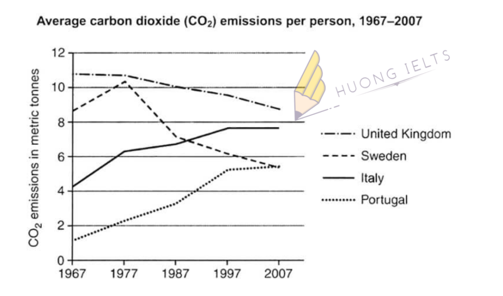
The graph below shows average carbon dioxide emissions per person in the United Kingdom, Sweden, Italy, and Portugal between 1967 and 2007.
Summarise the information by selecting and reporting the main features, and make comparisons where relevant.

My essay:
The line graph compares four different countries in terms of their average CO2 emissions per person between 1967 and 2007.
Overall, it is clear that CO2 emissions in the UK and Sweden fell steadily from 1967 to 2007 whereas Italy and Portugal witnessed an increase in their emissions. Also, the figures for the UK, despite the steady reduction, were always the highest in all 4 decades.
In 1967, each British citizen emitted roughly 10.5 tonnes of CO2 while the average amount of CO2 emitted by each person in Portugal was only about 1.5 tonnes. Over the following 40 years, CO2 emissions per person in the UK dropped by 2 tonnes. On the other hand, the figure for Portugal rose by approximately 4 tonnes.
Sweden’s CO2 emissions saw a rapid growth to nearly 10.5 tonnes during the first decade but then fell considerably to 5.5 tonnes in 2007. Finally, CO2 output per person in Italy almost doubled between 1967 and 1997 (from 4 tonnes to nearly 8 tonnes) before remaining stable towards the end of the period.


Leave a Comment