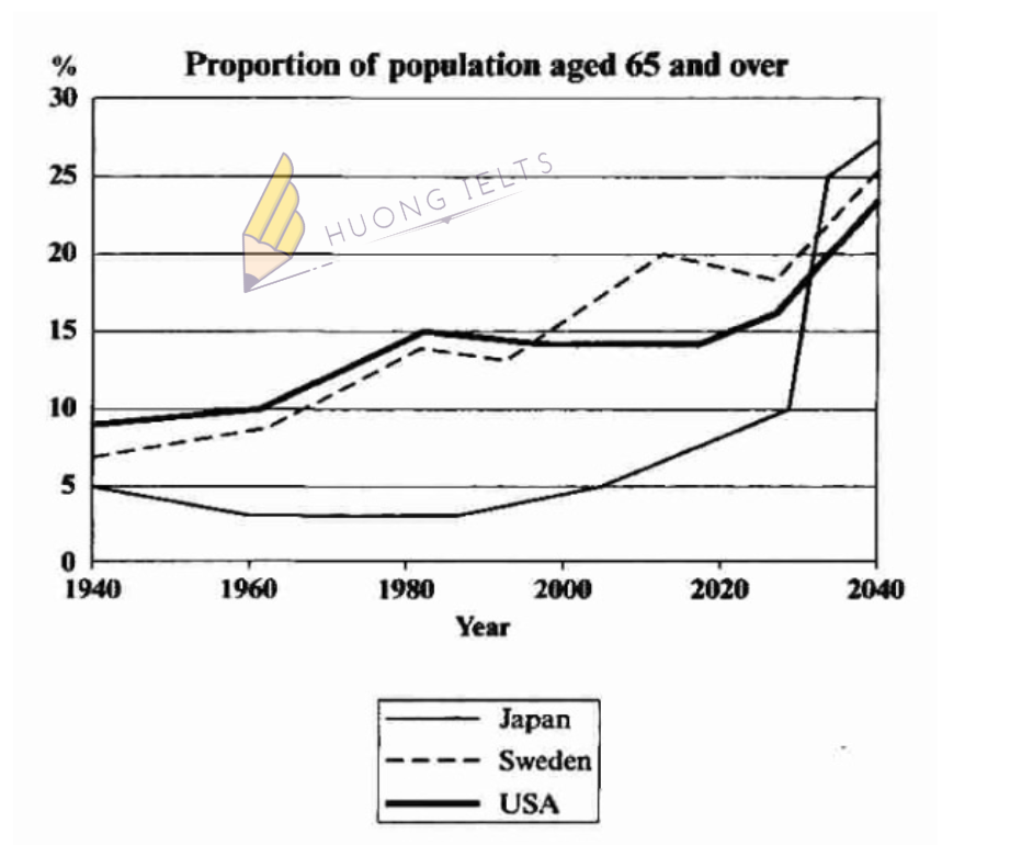
The graph below shows the proportion of the population aged 65 and over between 1940 and 2040 in three different countries.
Summarise the information by selecting and reporting the main features, and make comparisons where relevant.

My essay:
The line graph illustrates the percentage of old people in Japan, Sweden, and the USA over a 100-year period.
Overall, it is noticeable that all three countries experience an increase in their percentage of the population aged 65 or over between 1940 and 2040. In addition, the figure for Japan is predicted to be the highest by 2040.
In 1940, 9% of American citizens were 65 years old or over whereas the proportions of the elderly in Sweden and Japan accounted for only 7% and 5%, respectively. Over the following 40 years, Japan saw a small drop of 1% in the percentage of its aged population. By contrast, the figures for the USA and Sweden rose by 6% and 7% in the same period.
Looking into the future, it is surprising that sudden growth is expected for the percentage of the Japanese population aged 65 or over. By 2040, it is anticipated that 27% of Japan’s people will be 65 years old or over while the respective figures for the USA and Sweden will be a little lower, at approximately 24% and 25%.


Leave a Comment