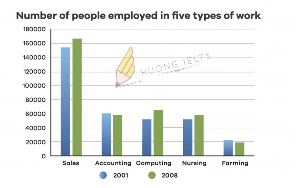
The chart below shows the number of people employed in five types of work in a certain region in Australia in 2001 and 2008.
Summarise the information by selecting and reporting the main features, and make comparisons where relevant.


The chart below shows the number of people employed in five types of work in a certain region in Australia in 2001 and 2008.
Summarise the information by selecting and reporting the main features, and make comparisons where relevant.

Hi em! Chỗ who em thiếu people nhé
The number of people working in sales em chia to be là “was” nhé
Em xoá bớt liên từ “however” vì trước nó không có câu đối lập nhé.
Ở câu cuối em xoá bớt chữ people nhé. Nó bị dư.
There were significant rises nhé em. Rise trong trường hợp này là danh từ nó cần tính từ bổ nghĩa không phải trạng từ.
E sửa lại r nhé cô.
The bar chart illustrates the number of people who were employed in five different jobs namely sales, accounting, computing, nursing, and farming over the given period of 7 years.
Overall, it is clear that in 2001 and 2008, the number of people who worked in sales stood at the highest place. In contrast, the figure for farming sector stood at the lowest place.
In 2001, the number of people working in sales were 155,000 while the figures for accounting, and farming was far lower, at 60,000, and 20,000 people respectively. In 2008, the number of people who worked in sales rose by around 8000. In contrast, there were slight decreases in the figures for accounting, and farming, reducing by 1000 people, and 2000 people respectively.
Looking at the bar chart in detail, we can see that in 2001, the number of people employed in computing, and nursing were equal (50,000 each). Finally, in 2008, the figures for computing, and nursing increased by 15,000, and 9000 people respectively.
Hi em! The number of people ở đây là chủ ngữ số ít nên em to be là “was” nhé
Còn the figures là chủ ngữ số nhiều nên e chia to be là “were”