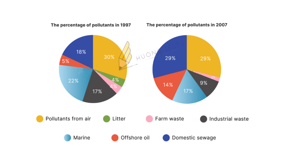
The two pie charts show the percentage of pollutants entering a particular part of the ocean in 1997 and 2007.
Summarise the information by selecting and reporting the main features, and make comparisons where relevant.

My essay:
The pie charts compare the figures for seven types of pollutants that entered a certain part of the ocean between 1997 and 2007.
Overall, it is clear that the air was the primary factor polluting the ocean. Also, while the proportions of offshore oil and domestic sewage pollutants rose significantly, the five other sources of pollution saw a downward trend over the period of 10 years.
In 1997, 30% of pollutants in the ocean came from the air, followed by marine and domestic sewage pollutants, taking up 22% and 18%, respectively. Over the following 10 years, the figures for airborne and marine sources of pollution dropped by 1% and 5%. By contrast, there was a considerable increase of 11% in domestic sewage pollutants.
The percentage of offshore oil that contaminated the ocean rose to 14% in 2007, nearly three times higher than ten years earlier. On the other hand, between 1997 and 2007, the figures for industrial and farm pollutants fell from 17% to 9 % and from 4% to 2%, respectively. Finally, litter made up 4% at the beginning but then surprisingly disappeared from the ocean in 2007.


Leave a Comment