Topic: line graph
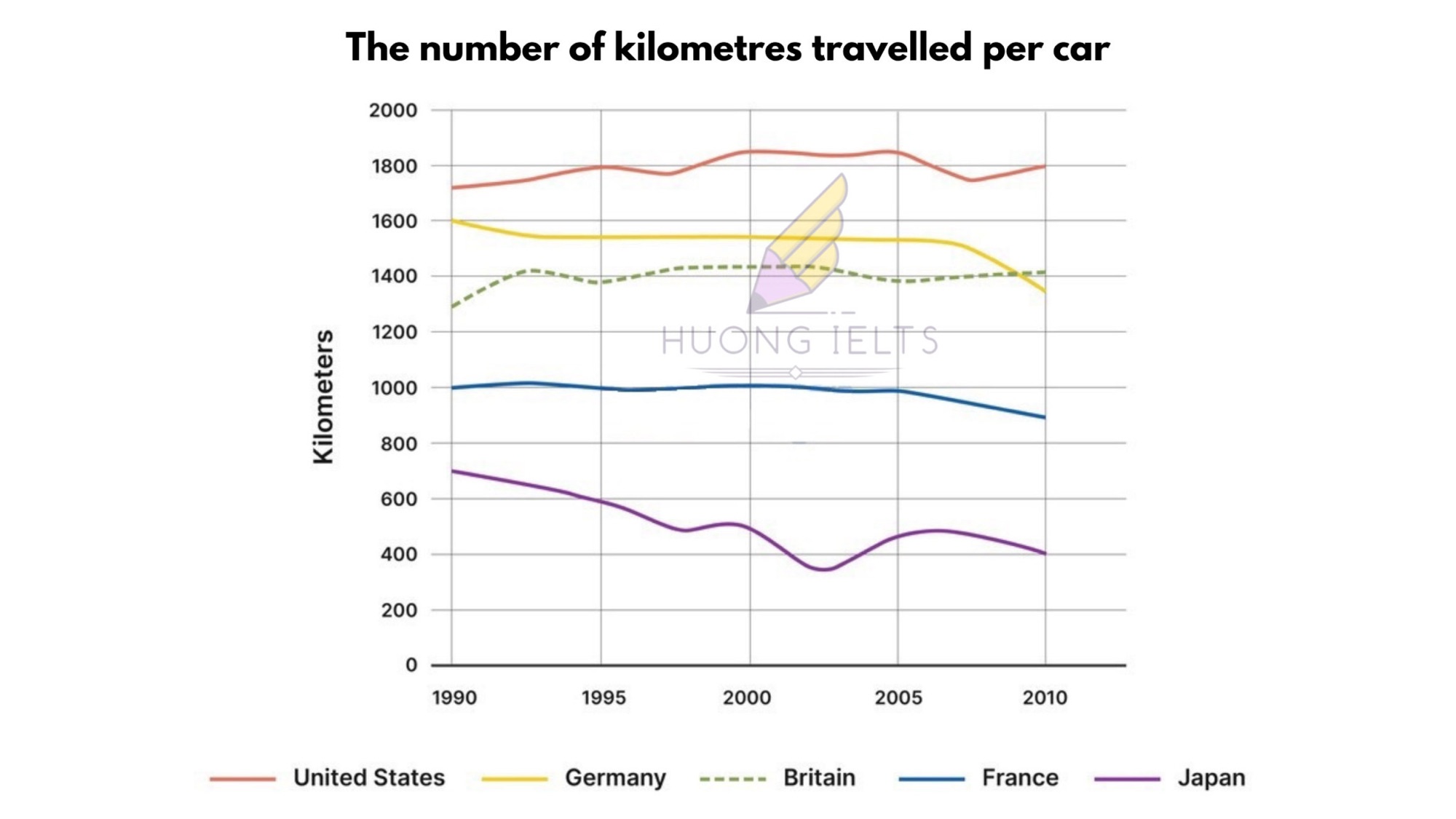
The line graph shows the number of kilometers traveled per car in five countries between 1990 and 2010.

My essay:
The line graph illustrates the distance traveled per car in five different countries over a 30-year period.
Overall, it is evident that the United States consistently recorded the highest number of kilometers traveled per car between 1990 and 2010. Additionally, both the US and Britain experienced slight increases in the distance traveled per car, while the figures for the other three nations declined over the years.
In 1990, each car in the US traveled approximately 1,700 km, whereas in Germany, the distance per car stood at roughly 1,600 km. Over the subsequent three decades, the figures for the US witnessed minor fluctuations, reaching a peak of around 1,850 km in 2000. In contrast, Germany’s figure dropped to 1,550 km in 1993, remained nearly unchanged until 2007, and then fell to just below 1,400 km by 2010.
Looking at the line graph in detail, we can see that Britain showed a relatively stable trend compared to the other countries. Its figure started at 1300 km per car in 1990, rose to 1400 km in 1993, and leveled off thereafter. Conversely, there were decreases in France and Japan, with the figures for both countries remaining below 1100 km over the given period.


