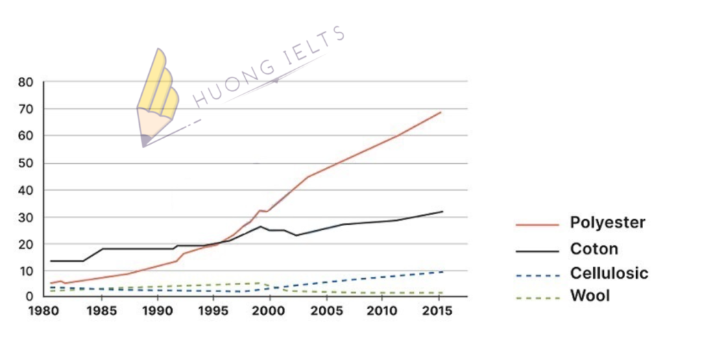
The line graph shows the percentage of the global demand for different textile fibers between 1980 and 2015. Summarise the information by selecting and reporting the main features, and make...
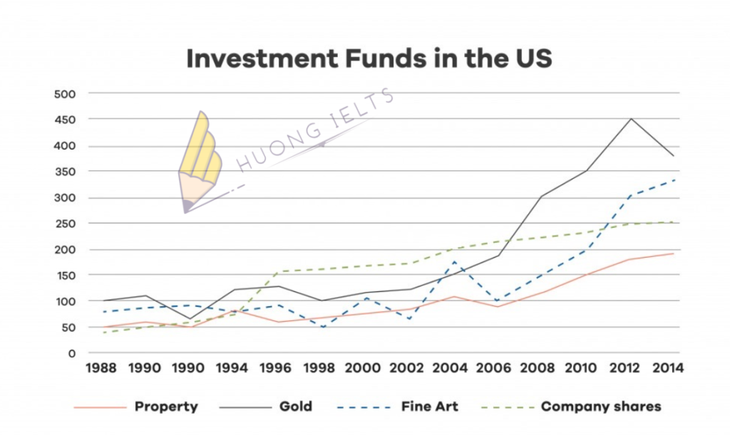
The graph shows the value in US dollars (in millions of dollars) of investment in funds of four categories from 1988 to 2014. Summarise the information by selecting and reporting...
The pie chart below shows the main reasons why agricultural land becomes less productive. The table shows how these causes affected three regions of the world during the 1990s. Summarise...
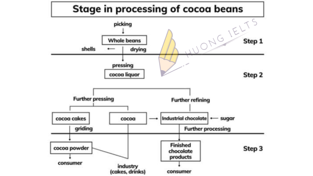
The diagram below shows the process of making chocolate from cocoa beans Summarise the information by selecting and reporting the main features, and make comparisons where relevant.
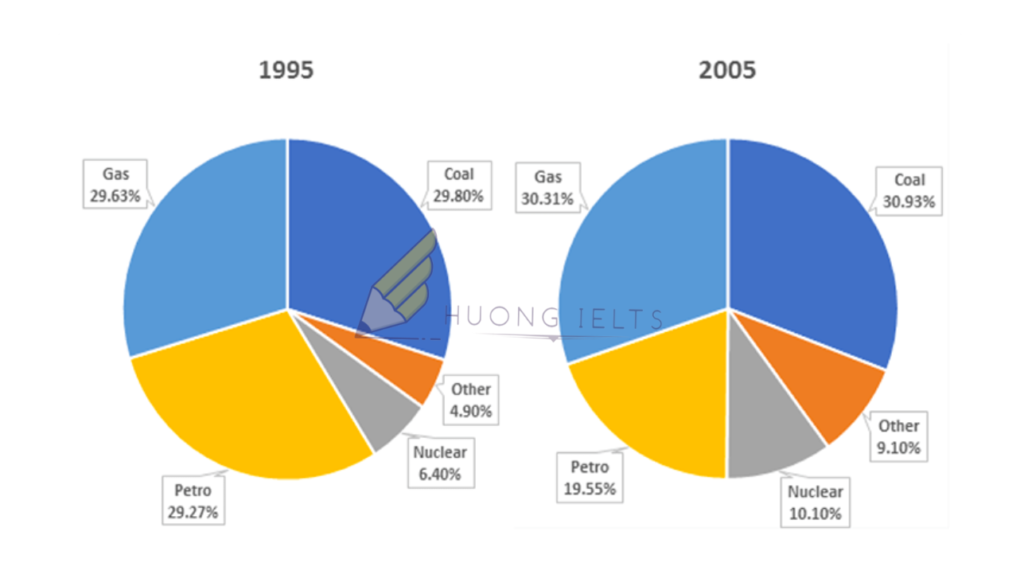
The pie charts below show a comparison of different kinds of energy production in France in 1995 and 2005. Summarise the information by selecting and reporting the main features, and...
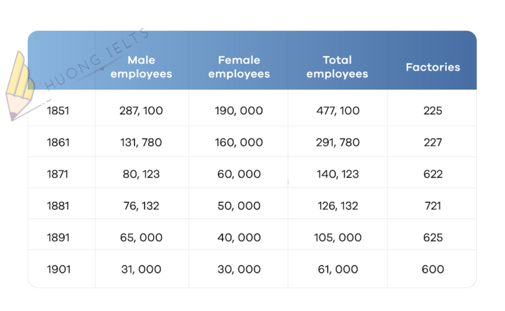
The table below describes the number of employees and factories in England and Wales from 1851 to 1901. Summarise the information by selecting and reporting the main features, and make...
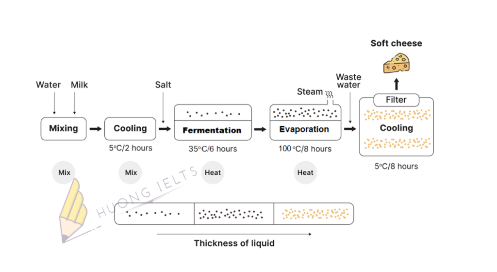
The diagram shows the process of making soft cheese. Summarise the information by selecting and reporting the main features, and make comparisons where relevant.
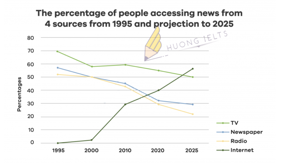
The line graph shows the percentage of people accessing news from 4 sources from 1995 and projection to 2025.Summarise the information by selecting and reporting the main features, and make...
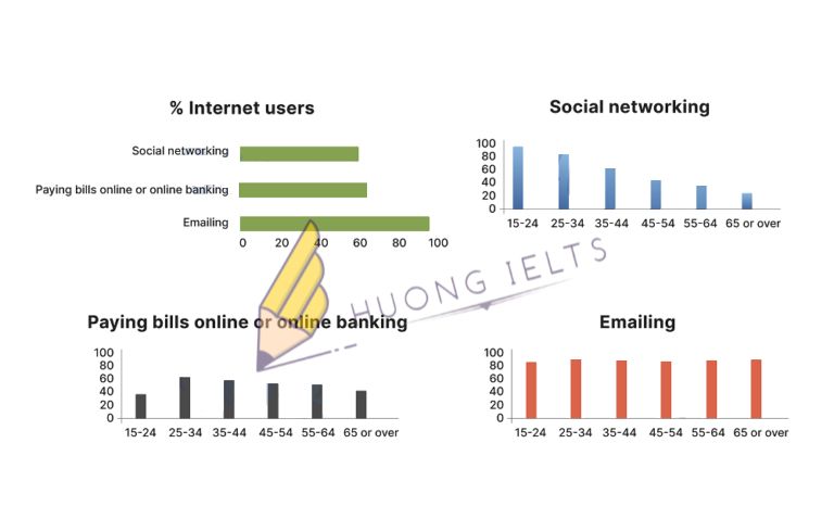
The charts below show Australian people in different age groups who used the internet for three reasons.Summarise the information by selecting and reporting the main features, and make comparisons where...
Task 2: Today many countries import food from different parts of the world. Is this a positive or negative development?My essay:In recent years, there has been an increase in imports...

