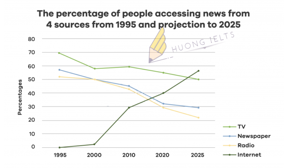
The line graph shows the percentage of people accessing news from 4 sources from 1995 and projection to 2025.Summarise the information by selecting and reporting the main features, and make...
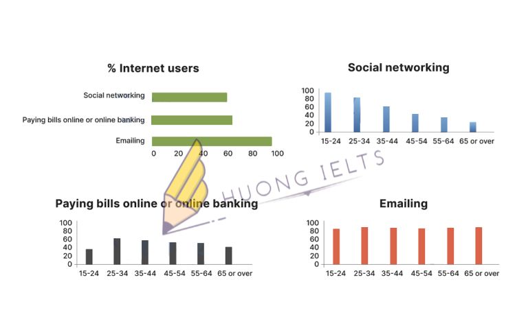
The charts below show Australian people in different age groups who used the internet for three reasons.Summarise the information by selecting and reporting the main features, and make comparisons where...
The bar chart shows the percentage of school children learning to play four different musical instruments (violin, guitar, piano, and drums) in 2005, 2010, and 2015. Summarise the information by...
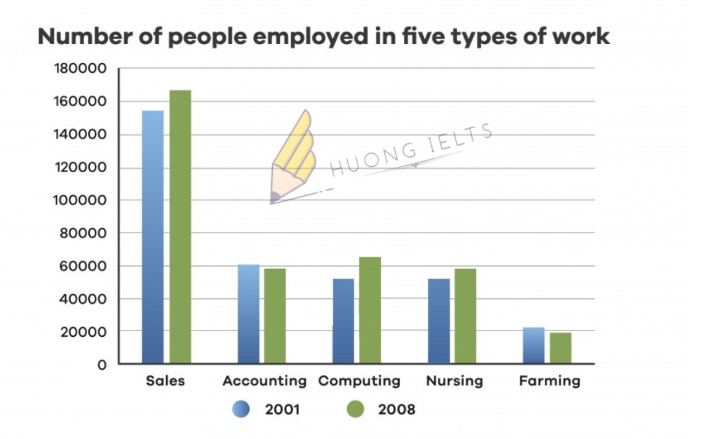
The chart below shows the number of people employed in five types of work in a certain region in Australia in 2001 and 2008. Summarise the information by selecting and...


