MẪU IELTS WRITING TASK 2Topic 7: More and more people decide to eat healthy food and exercise regularly. What are the reasons for this trend? What can be done to...
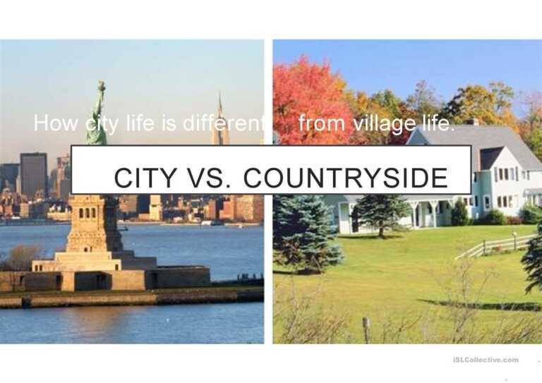
MẪU IELTS WRITING TASK 2Topic 6: Many people believe that it is easier to have a healthy lifestyle in the countryside. Other believe that there are health benefits of living...
Part 2: Describe your childhood friend. When I was a kid, I was rather timid and introverted so I only had one close friend, his name is Tom. When we...
Ok, so today I’m going to talk about one of my favorite singers, Tom, he has been famous in Vietnam for approximately seven years. If I’m not mistaken, I first...
Task 2: Some countries allow old people to work to any age that they want. Do the advantages outweigh the disadvantages?MY ESSAY:People nowadays live longer and more healthily due to...
Task 2: Children should do organized activities in their free time while others believe children should be free to do what they want. Discuss both views and give your opinion?...
The bar chart shows the percentage of small , medium, large companies which used social media for business purposes between 2012 to 2016. Summarise the information by selecting and reporting...
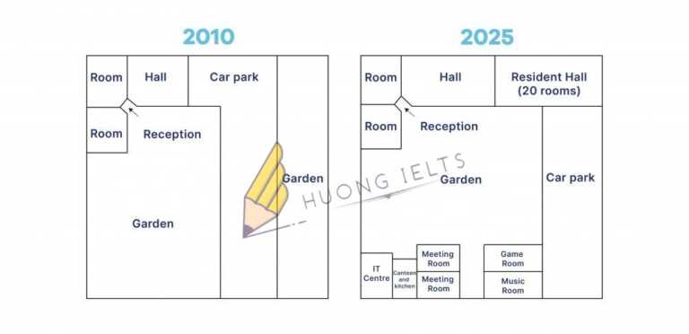
The pictures below show the difference in the layout of the conference centre in 2010 and 2025. Summarise the information by selecting and reporting the main features, and make comparisons...
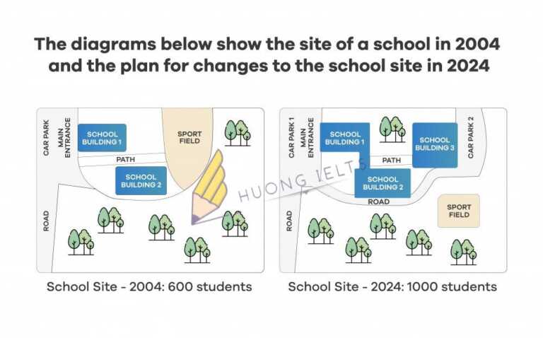
The diagrams below show the site of a school in 2004 and the plan for changes to the school site in 2024. Summarise the information by selecting and reporting the...
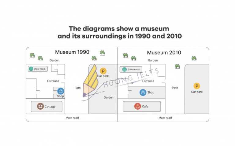
The diagrams show a small museum and its surroundings in 1990 and 2010. Summarise the information by selecting and reporting the main features, and make comparisons where relevant.
