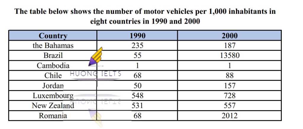
The table below shows the number of motor vehicles per 1,000 inhabitants in eight countries in 1990 and 2000. Summarise the information by selecting and reporting the main features and...
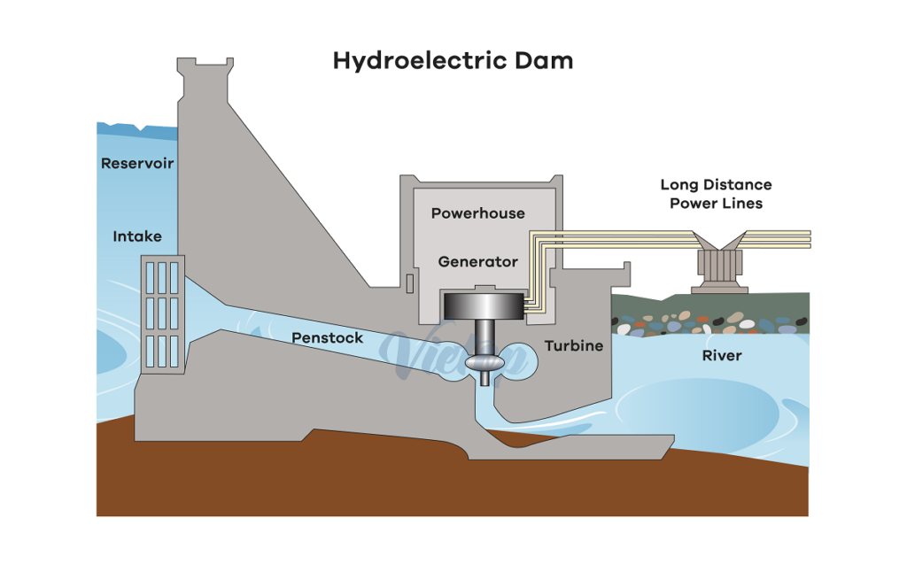
The diagram shows how electricity is generated by a hydroelectric dam.Summarise the information by selecting and reporting the main features, and make comparisons where relevant. My essay:The diagram illustrates the...
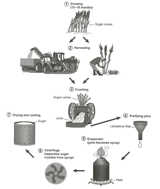
The diagram below shows the manufacturing process for making sugar from sugar cane.Summarise the information by selecting and reporting the main features, and make comparisons where relevant. My essay:The diagram...
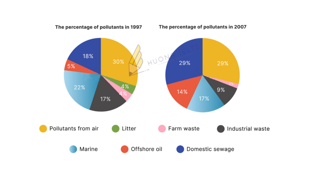
The two pie charts show the percentage of pollutants entering a particular part of the ocean in 1997 and 2007.Summarise the information by selecting and reporting the main features, and...
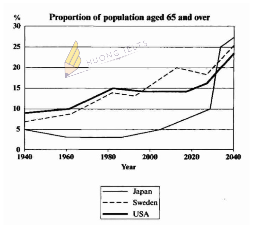
The graph below shows the proportion of the population aged 65 and over between 1940 and 2040 in three different countries. Summarise the information by selecting and reporting the main...
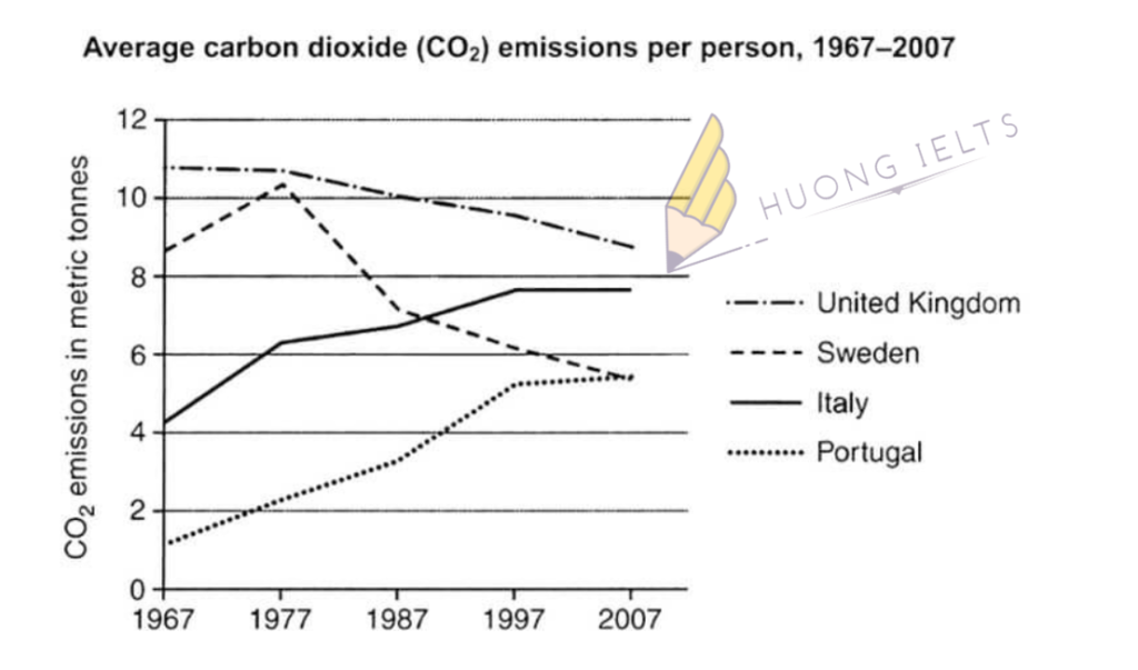
The graph below shows average carbon dioxide emissions per person in the United Kingdom, Sweden, Italy, and Portugal between 1967 and 2007. Summarise the information by selecting and reporting the...
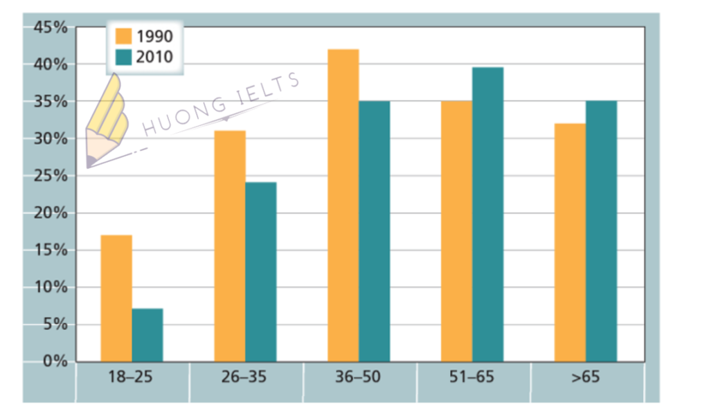
The chart below gives information on the percentage of British people giving money to charity by age range for the years 1990 and 2010. Summarise the information by selecting and...
The bar chart shows the percentage of school children learning to play four different musical instruments (violin, guitar, piano, and drums) in 2005, 2010, and 2015. Summarise the information by...
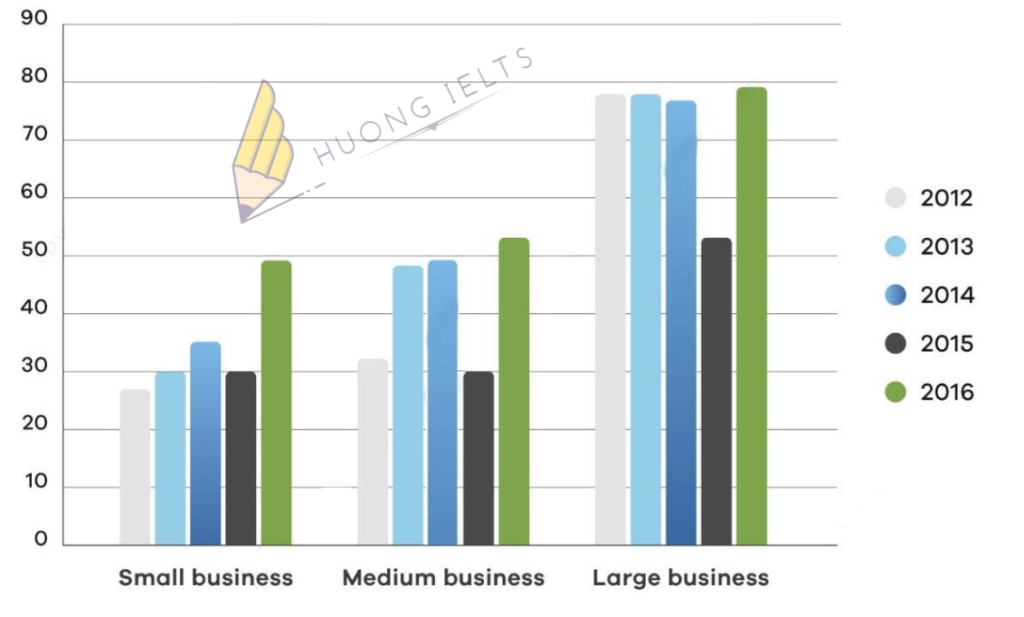
The bar chart shows the percentage of small , medium, large companies which used social media for business purposes between 2012 to 2016. Summarise the information by selecting and reporting...
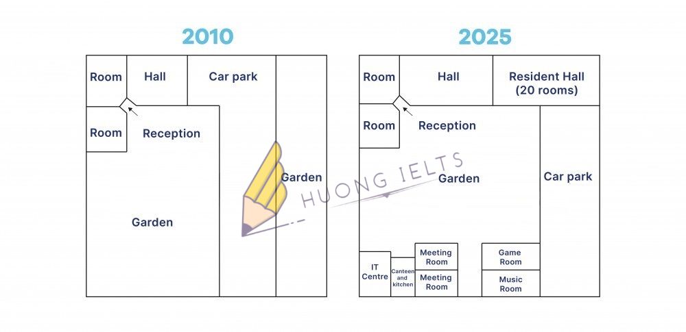
The pictures below show the difference in the layout of the conference centre in 2010 and 2025. Summarise the information by selecting and reporting the main features, and make comparisons...

